FidelSec
A complete brand identity for FidelSec, a consultancy that helps organisations manage cybersecurity, privacy and compliance through a combination of technical and legal expertise. The identity was designed to communicate protection and precision without making the company feel distant or unnecessarily complicated. It positions FidelSec as a knowledgeable security partner that turns complex risks into practical and understandable guidance.
FidelSec needed a distinctive identity capable of bringing several connected disciplines under one recognisable brand: cybersecurity, privacy, governance and regulatory compliance. The brand had to appeal to organisations that require serious technical and legal expertise, while remaining accessible to decision-makers who may not have a specialist background. Its communication therefore needed to feel professional and authoritative without relying on excessive jargon, fear-based messaging or anonymous corporate language. Beyond the central identity, the assignment required a flexible system that could support multiple services, branded documents, educational materials, digital communication and future organisational growth.
Cybersecurity branding frequently relies on the same visual vocabulary: neon interfaces, padlocks, shields and dark screens filled with decorative code. The challenge was to communicate security and advanced expertise without producing another identity that looked like it had escaped from a generic server-room template. FidelSec also operates at the intersection of technical protection and legal compliance. The identity therefore needed to represent both technological precision and structured governance, while still supporting a brand personality defined as accessible, knowledgeable, reliable, pragmatic and innovative. The system also had to remain coherent across both light and dark environments, different service areas and communication formats, from formal certificates to direct commercial one-pagers.
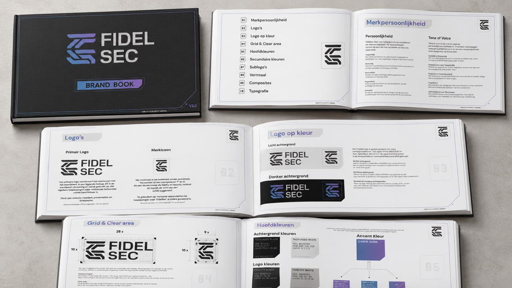
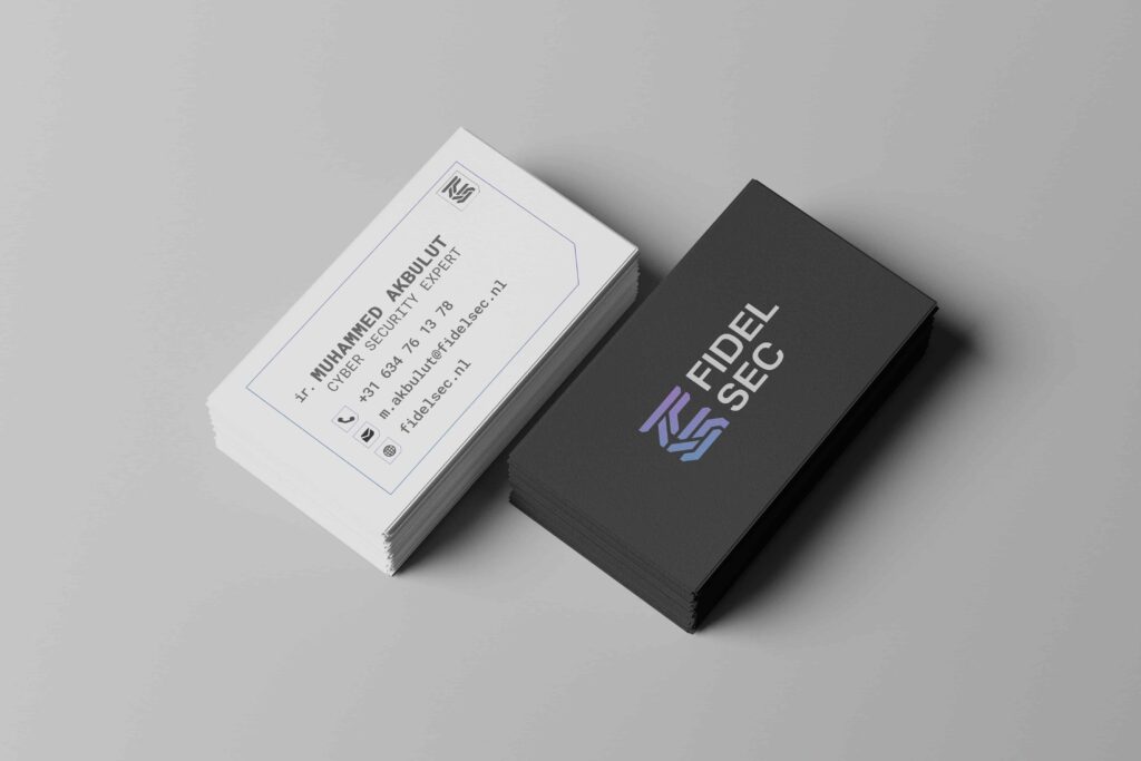
I developed a modular identity centred on a geometric symbol formed from an interwoven F and S. The mark functions as a visual connection between fidelity and security while subtly suggesting the protective structure of a shield.
The symbol was paired with a compact wordmark that could operate as a complete horizontal logo or as a standalone icon for smaller and square applications. A fixed construction grid, clear-space rules and minimum-size specifications were created to preserve the proportions and recognition of the identity across print and digital use.
The wider visual system includes:
a controlled dark-and-light foundation built around aged black, softened white and warm grey tones the Cyber Dusk gradient, combining blue and purple to introduce a more distinctive technological character secondary colours for different services and information categories an endorsed sub-brand structure for Compliance & Governance and Managed Services a geometric form language based on cropped corners, outlined panels, modular grids and technical interface references Inter as the primary typeface for clarity and digital readability defined composition rules for structured but flexible layouts a tone of voice that is clear, professional, supportive and understandable
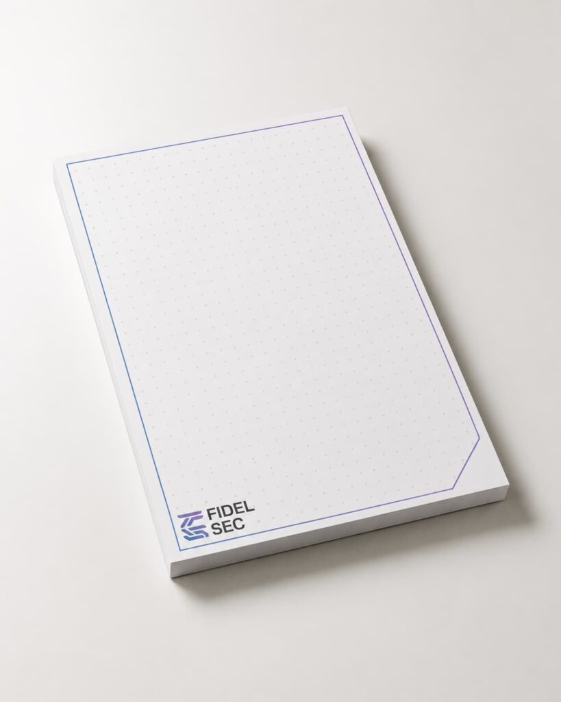
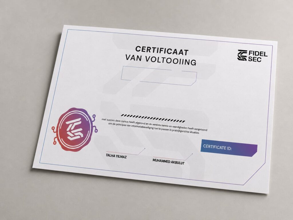
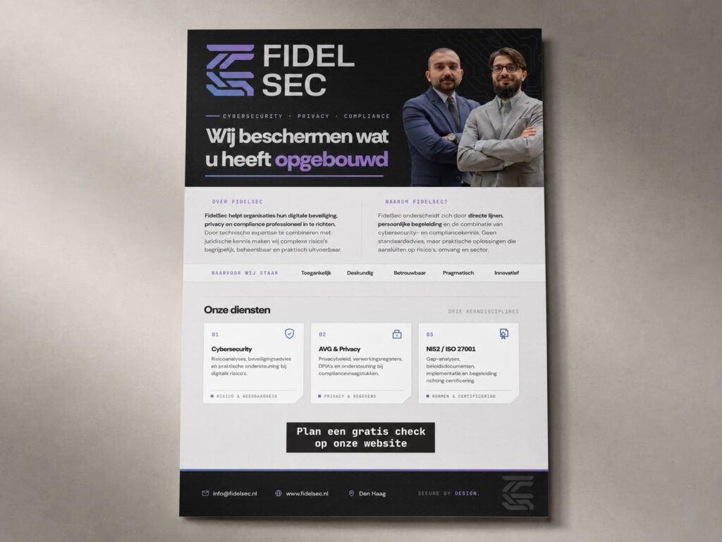
I documented the system in a complete brandbook and applied it across practical assets including a company one-pager, completion certificates and branded stationery. The one-pager translates the identity into a concise commercial overview of FidelSec’s cybersecurity, privacy and compliance services.
The project resulted in a complete and immediately usable brand system that gives FidelSec a clear position within the cybersecurity and compliance sector.
The identity connects its technical and legal disciplines through one recognisable visual language, while the sub-brand architecture allows individual services to develop their own emphasis without fragmenting the wider brand.
The brandbook now provides consistent rules for logos, colour, typography, composition and tone of voice, enabling FidelSec to communicate coherently across its website, presentations, proposals, educational materials, certificates and future campaigns.
The final applications demonstrated that the identity could move between formal, commercial and educational contexts while preserving the same balance of technical precision, trust and accessibility. The result is not merely a logo, but a scalable communication framework designed to support FidelSec as its services and audience expand.