Lipton
A premium packaging and product design project for Lipton, focused on redesigning flavour graphics for tea tin boxes and smaller tea packaging, while also developing a bamboo teabox system for high-end horeca and gifting. The work combined brand consistency, luxury presentation and sustainable product development, with special attention to material application, inlay fit and production tolerances.
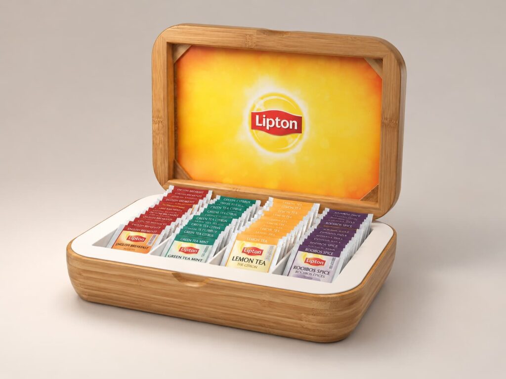
The assignment was to develop a renewed visual system for Lipton’s flavour tins used to store tea sachets, as well as the smaller accompanying packaging inside the range. These products were intended for high-class horeca settings and relatiegeschenken, meaning the packaging needed to perform beyond simple shelf presence. It had to communicate quality, refinement and consistency in spaces where the product would be seen, handled and presented directly to guests or recipients. Alongside the graphic redesign, I was also tasked with designing and producing a bamboo teabox system in two variants, intended to present the tea assortment in a more elevated and sustainable way while staying recognisably Lipton.
The challenge was not only to make the tea range look more beautiful, but to redesign it in a way that felt unmistakably Lipton while becoming significantly more premium. The flavour graphics needed to create a clearer, more cohesive family across the range, while still giving each tea variant its own distinct identity. The packaging had to feel warm, refined and visually rich, but without drifting too far from Lipton’s existing brand image and recognition. On the product side, the bamboo teabox introduced another layer of complexity. It needed to express sustainability and luxury at the same time, while also being feasible to manufacture. A key challenge was translating the design into a bamboo construction that could be produced accurately, fit together cleanly with the internal inlay, and preserve the intended finish quality. The positioning of the Lipton logo during production was also a technical challenge: it needed to sit at the correct angle, in the correct position, and remain visually precise within real production tolerances. In other words: premium presentation, but with the deeply glamorous backstage reality of tolerances, alignment and material behaviour.
Product and packaging concept.
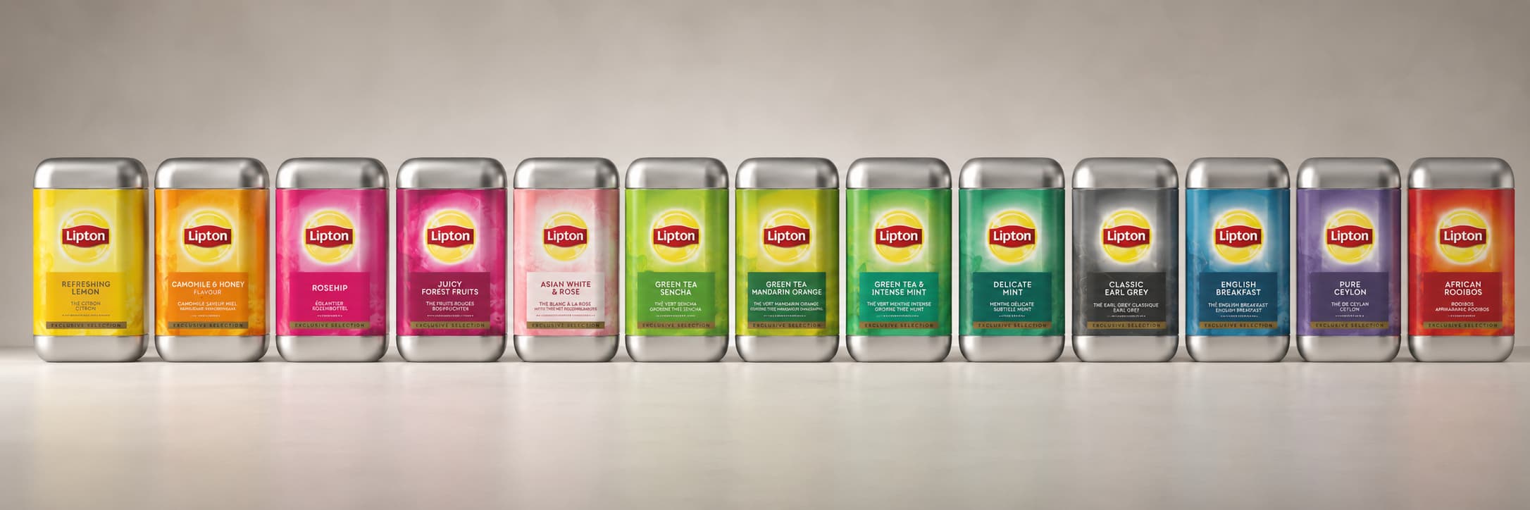
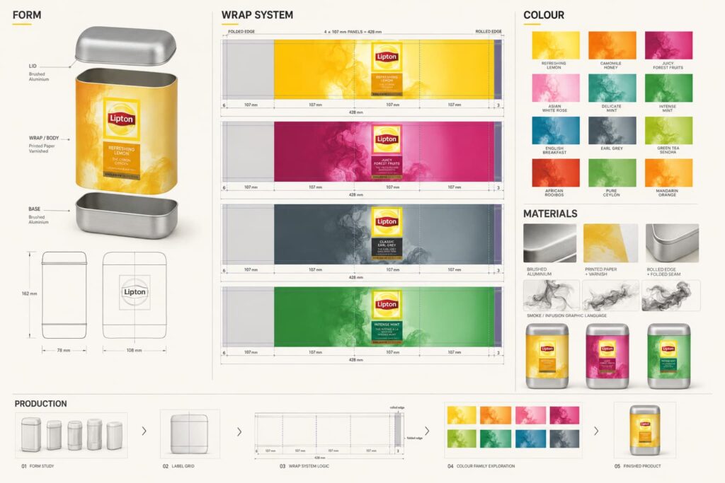
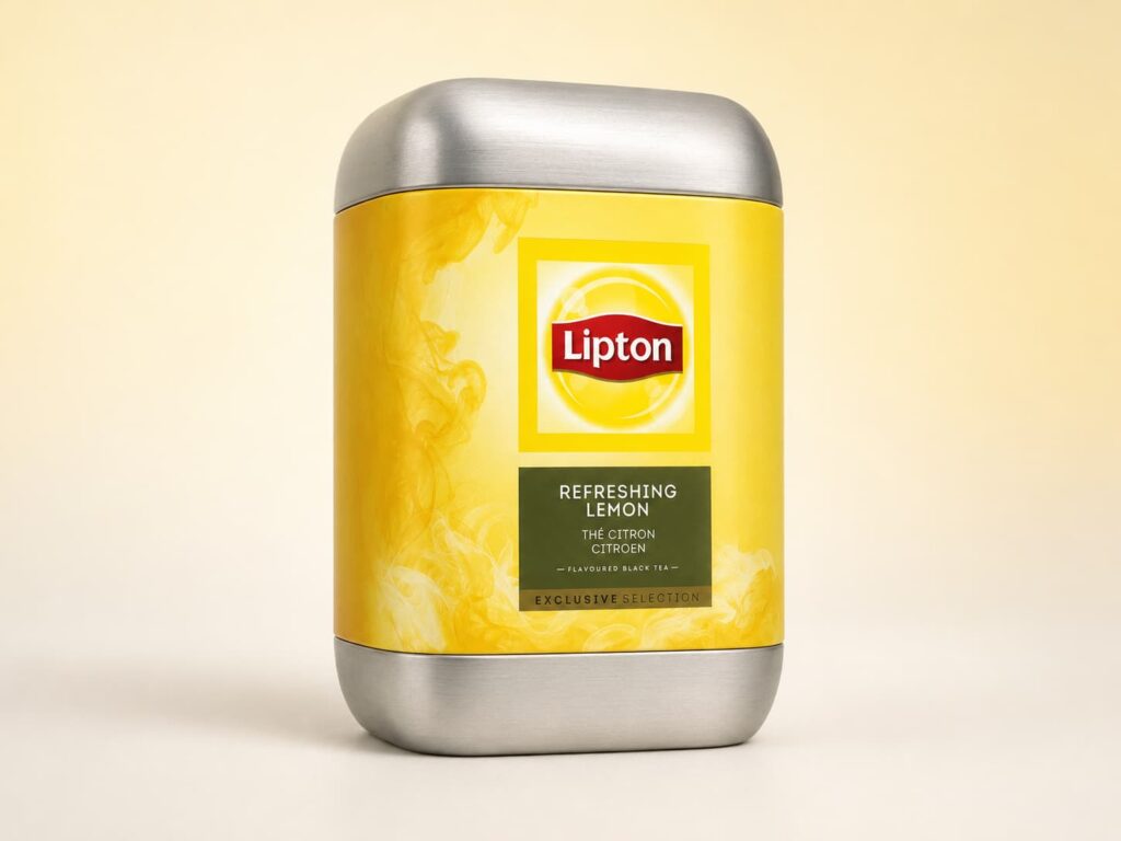
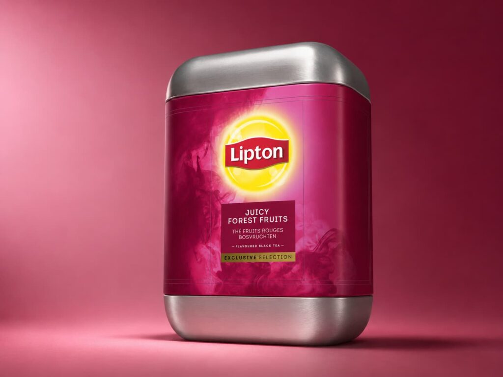
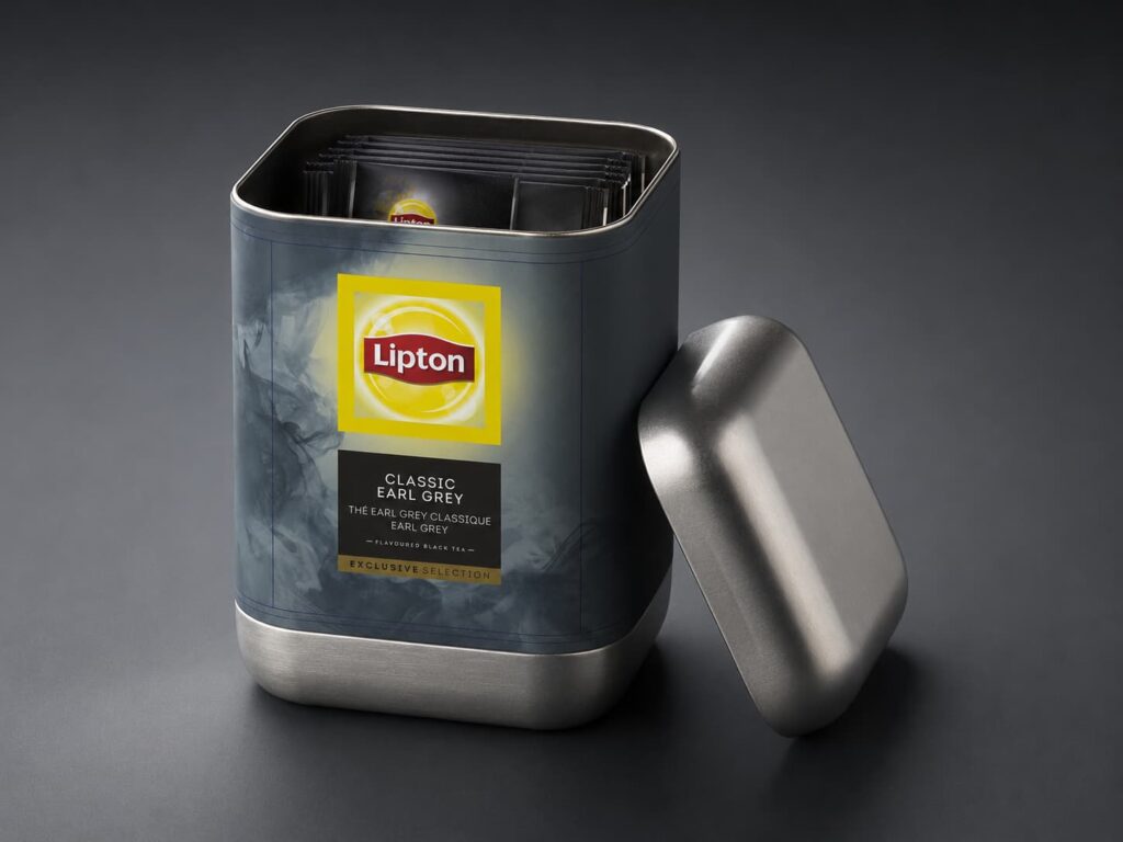
I developed a new graphic language for the Lipton flavour tins that gave the range a more elegant and premium appearance while preserving the recognisable Lipton identity.
The redesign introduced a clearer visual hierarchy across the packs, with flavour-specific colour worlds, a more refined composition and a luxurious image language suited to premium tea presentation. Each flavour retained its own identity, while the family as a whole became more consistent and better suited to upscale environments.
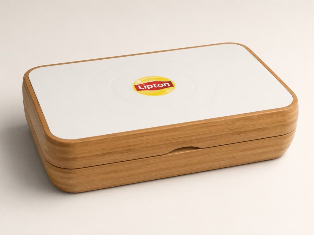
To support this packaging system, I also designed a bamboo teabox range in two variants. These boxes were developed as presentation objects rather than simple storage containers, intended to enhance the tea-serving experience in horeca settings and gifting use.
The bamboo boxes combined:
a sustainable natural material expression a clean premium exterior aligned with Lipton’s image an internal inlay system for organised presentation of tea sachets a logo application integrated into the lid a construction developed around production feasibility and fit
Part of the solution involved resolving how the bamboo components would be produced and assembled, how the inlay would sit within the box, and how the logo could be positioned accurately and consistently during production despite angular placement and tolerances.
The project therefore connected graphic packaging design, brand presentation, product design and production-aware detailing into one coherent premium tea experience.
The project resulted in a complete presentation upgrade for Lipton’s premium tea offering, spanning both the packaging graphics and the physical serving format.
The redesigned flavour tins created a stronger and more visually cohesive range, better suited to premium hospitality use and gift presentation. At the same time, the bamboo teaboxes translated the brand into a more tactile, sustainable and elevated product experience.
Together, these outcomes helped position the tea assortment as more than a consumable product: it became a curated presentation object suitable for luxury hospitality, guest-facing service and relationship gifting.
Beyond the visual result, the project also resolved a number of practical development questions around fit, construction, logo placement and production tolerances, making the concept stronger not only as a design proposal but as a manufacturable presentation system.