Bella Mama
Bella Mama is a maternal-care and wellness brand supporting women during pregnancy, childbirth, the postpartum period and beyond. The identity was designed to communicate softness and personal attention without appearing informal or medically distant. Its visual language combines warm pink tones, gentle forms and tactile applications to position Bella Mama as both a caring personal service and a credible professional practice. Bella Mama’s services include doula and postpartum support, home treatments, pregnancy education, women’s wellness services and professional courses for care practitioners.
Bella Mama needed a complete identity capable of bringing several connected services under one recognisable name. The brand works across personal guidance, treatments, maternal recovery, educational courses and physical wellness products. This created a broad communication challenge: the identity needed to feel reassuring and intimate for mothers, while also appearing structured and credible when used for professional training and certification. The assignment therefore extended beyond designing a logo. It required a flexible visual system that could function across treatment materials, packaging, product labels, textiles, certificates and online communication.
Brands aimed at mothers and women’s wellbeing often default to predictable pastel graphics and decorative femininity. The result can feel pleasant, but also generic, fragile or insufficiently professional. Bella Mama needed warmth without becoming sentimental, and authority without adopting the cold visual language of conventional healthcare. The identity also had to serve two different relationships. For individual clients, it needed to feel personal, safe and nurturing. For professionals following courses or receiving certification, it needed to communicate knowledge, quality and formal recognition. The central challenge was to let those qualities coexist within one system rather than creating one identity for care and another for expertise.
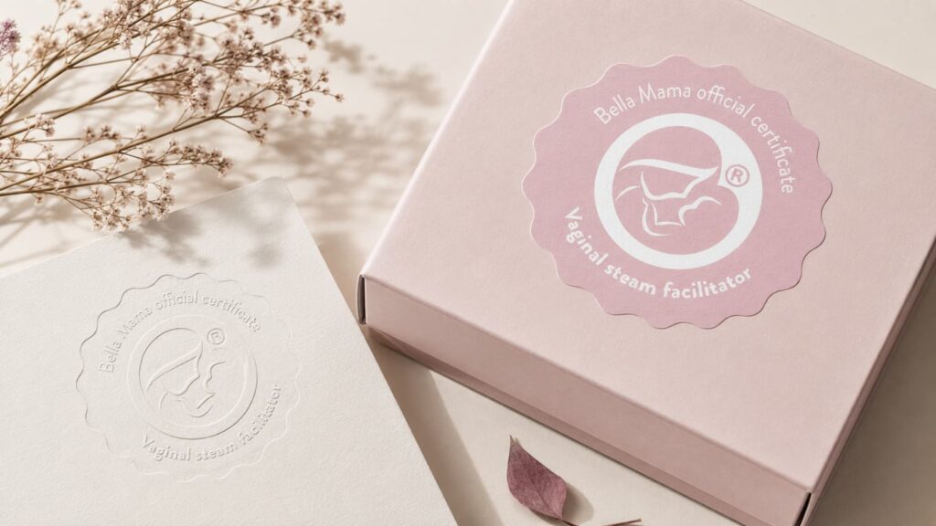
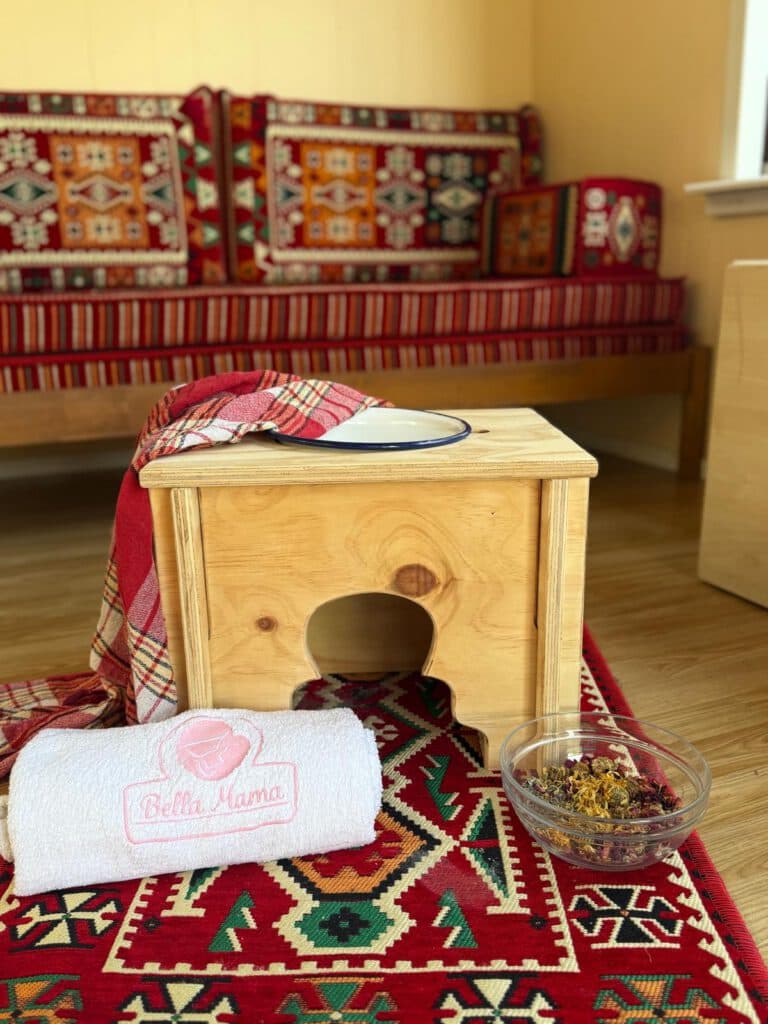
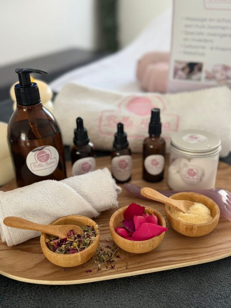
I created a complete brand identity built around a soft pink palette, rounded shapes and a central line-based symbol representing motherhood, protection and the female body.
The primary mark was designed to remain clear and recognisable across both intimate and formal applications. Its circular construction creates a sense of care and enclosure, while its restrained linework prevents the identity from becoming overly decorative.
Alongside the primary logo, I developed a dedicated Bella Mama certification seal. This allowed professional qualifications and course materials to carry a more formal mark while remaining clearly connected to the main brand.
The wider system was applied across:
branded product and shipping boxes embossed certificates and presentation folders treatment oils, sprays, creams and herbal products embroidered towels and textiles course and facilitator materials wellness and treatment equipment digital and social-media communication photography and product presentation
The colour palette uses muted blush and cream tones rather than highly saturated pink, creating a more mature and calming expression. Natural materials, soft light and warm product photography reinforce the brand’s connection to personal care, recovery and hands-on treatment.
Packaging and labels were kept deliberately simple so the products feel trustworthy and carefully prepared rather than commercially overdesigned. The certification applications introduce a more official layer, giving the system enough range to move between a private treatment setting and a professional training environment.
The project resulted in a complete and adaptable brand system that gives Bella Mama a consistent presence across its different activities.
The identity now connects personal maternal support, home treatments, wellness products and professional education through one recognisable visual language. The certification seal provides additional authority for training and facilitator programmes, while the softer consumer-facing applications preserve the warmth and accessibility of the service.
Across packaging, textiles, printed materials and treatment products, the brand feels like part of the same carefully considered experience. This helped Bella Mama present itself not merely as a collection of individual services, but as a complete platform for maternal care, recovery and professional knowledge.
The result balances emotional reassurance with professional credibility, which is harder than placing a pink logo on everything and declaring the maternal-care sector solved.