Yûva
Yûva is a garden café and boutique bakery built around warmth, attention and unhurried hospitality. The identity was designed to feel less like a commercial brand and more like a familiar place: calm, tactile and quietly refined. Its visual language combines botanical references, architectural illustration, natural colours and crafted textures to create an atmosphere in which guests are invited to slow down and stay.
The objective was to create a complete identity for a hospitality concept that combined the intimacy of a boutique bakery with the calm and natural character of a garden café. The brand needed to communicate quality and refinement without becoming formal, luxurious or distant. It had to feel authentic, human and carefully made, while remaining clear and recognisable across signage, menus, packaging, social media and other guest-facing applications. Beyond the logo, the assignment required a coherent system that could guide how Yûva looks, writes and behaves as the brand develops.
Hospitality brands often fall into one of two predictable traps: overly polished minimalism that feels sterile, or handcrafted aesthetics that become visually chaotic. Apparently food and balance remain natural enemies. The challenge was to position Yûva between these extremes. The identity needed to appear elegant but never pretentious, natural but not rustic, and distinctive without relying on short-lived visual trends. Every element therefore had to support the same emotional experience. The logo, colours, typography, illustrations and language all needed to communicate calmness, care, craftsmanship and a sense of belonging.
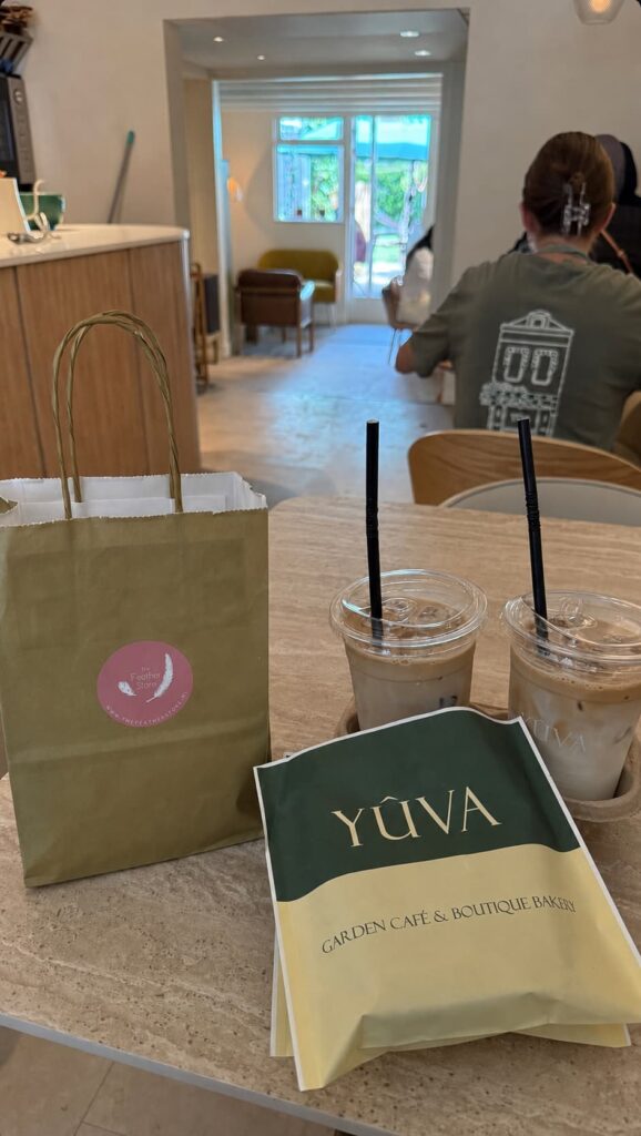
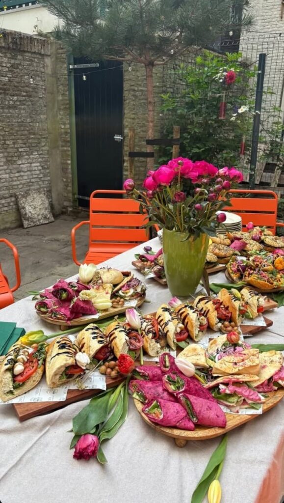
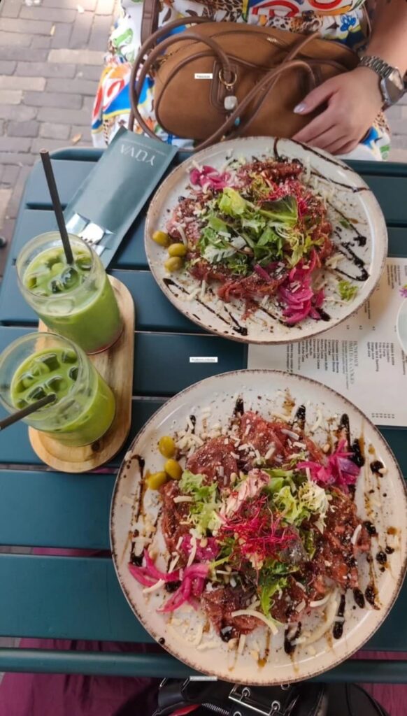
Identity and brand world.
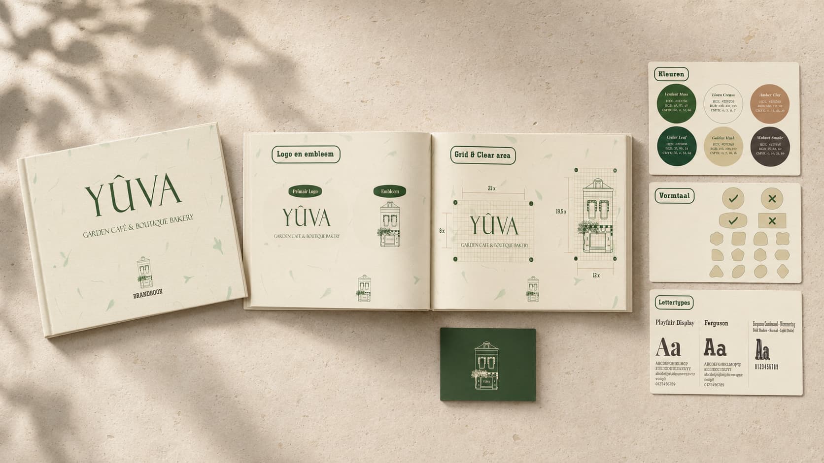
I developed Yûva as a complete brand world centred around five personality traits: calm and caring, earthy and refined, intuitive and sensitive, authentic and crafted, and timeless and modest. These principles became the foundation for both the visual identity and the tone of voice.
The primary identity consists of an elegant wordmark accompanied by the descriptor Garden Café & Boutique Bakery. The accent above the letter “Û” adds a recognisable detail while giving the name a distinct visual rhythm.
Alongside the wordmark, I created an illustrated emblem based on Yûva’s physical home. The building functions as more than a decorative icon: it gives the brand a sense of place, familiarity and ownership. The emblem can operate independently on packaging, labels, social media and applications where the full wordmark would feel too formal or visually heavy.
The wider system includes:
a natural colour palette built around deep greens, linen cream and warm earthy accents architectural and botanical illustration defined logo grids and clear-space rules an organic form language with rounded, deliberately imperfect geometry editorial typography combining refined serif forms with more expressive supporting type a tone of voice based on short, sensory and carefully paced language textured backgrounds that evoke paper, leaves and handcrafted materials
The brandbook translates these choices into clear guidelines, ensuring Yûva can remain consistent across physical and digital touchpoints without becoming rigid or overdesigned.
The project resulted in a fully defined brand identity that gives Yûva a clear emotional and visual position within the hospitality market.
The wordmark, architectural emblem, colour system, typography, form language and verbal identity now operate as one connected system. This gives Yûva the foundation to communicate consistently across storefront signage, menus, packaging, printed materials, social content and future brand applications.
More importantly, the identity captures the intended guest experience before anyone enters the space. It establishes Yûva as a thoughtful, handcrafted and welcoming destination rather than simply another café with beige walls and an expensive sourdough habit.