MAYBELLINE
Celebrating a century of beauty through a tactile brand object A commemorative notebook collection designed for Maybelline New York’s 100-year celebration. Created as corporate gifts for anniversary events and business relations, the notebooks transformed the visual language of makeup, fashion and New York into a functional keepsake. The collection balanced celebration, brand recognition and everyday usability through two complementary design families.
Maybelline New York required a series of notebooks to mark its centenary and support the brand’s 100-year anniversary event. The notebooks were intended as gifts for professional relations and event attendees. They therefore needed to feel more considered than ordinary promotional merchandise, while remaining immediately recognisable as Maybelline. The assignment called for multiple visual directions that could address different audiences and levels of gifting. Each concept needed to celebrate the anniversary, reflect the personality of the cosmetics brand and work convincingly as a physical notebook cover.
Maybelline’s identity is expressive, urban and closely connected to fashion, beauty and experimentation. A notebook is, by nature, a much quieter and more functional object. The central challenge was to preserve the confidence and visual energy of the brand without turning the notebooks into disposable event merchandise. The designs needed to feel celebratory while remaining attractive enough to use long after the anniversary event. A second challenge was creating clear differentiation within the collection. Some notebooks needed to reflect the raw, bold and accessible side of Maybelline, while others had to feel more exclusive and suitable for higher-value corporate gifts. Both directions still needed to belong unmistakably to the same centenary campaign.
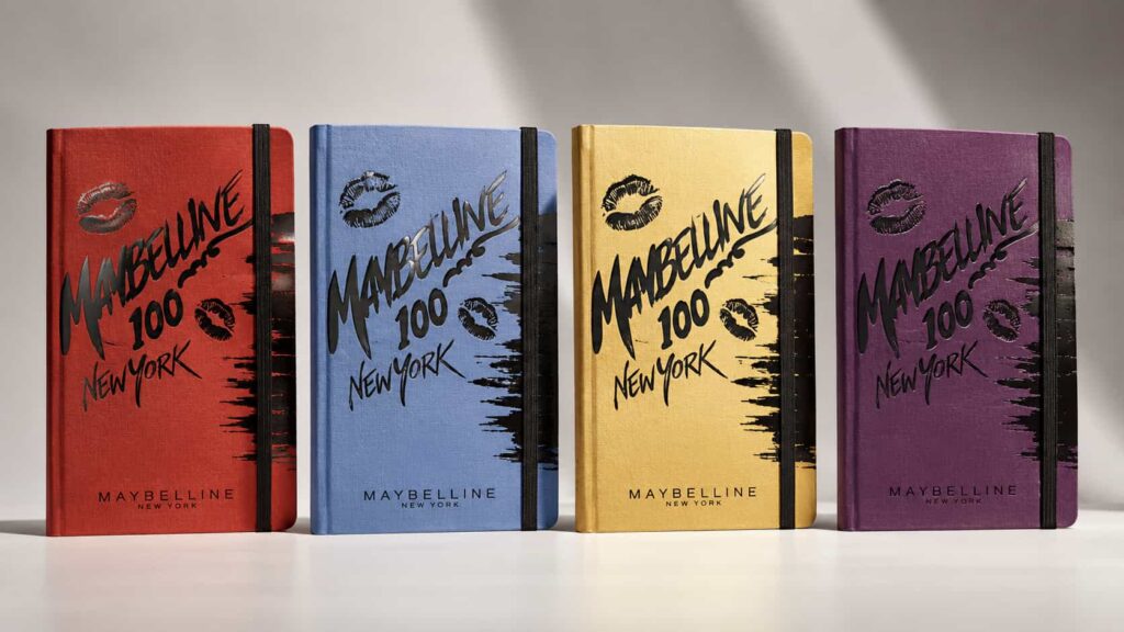
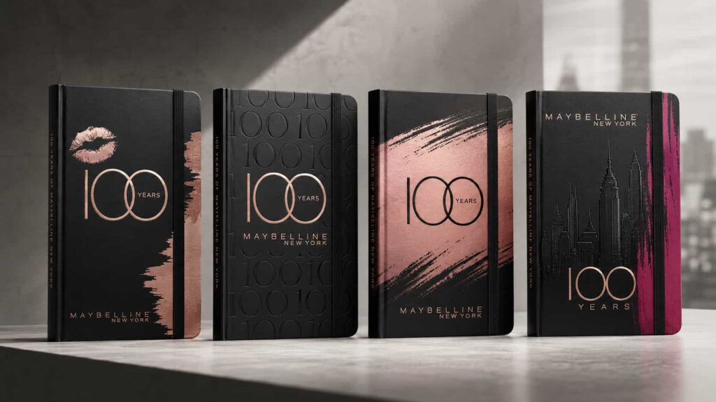
I developed two complementary design directions around the Maybelline New York 100-year milestone.
The expressive collection
The first direction captured the rawer and more energetic side of the brand through bold colour, makeup-inspired graphics and hand-drawn typography.
The covers used:
saturated red, blue, gold and purple colourways expressive brush marks inspired by cosmetic application lipstick-print graphics handwritten anniversary lettering high-contrast black detailing a visible connection to Maybelline’s New York identity
This direction was deliberately less polished and more spontaneous. It treated the notebook cover like a makeup surface: layered, imperfect and full of movement.
The premium collection
The second direction was developed for a higher-end segment and used a more restrained black foundation with metallic rose-gold and magenta detailing.
These concepts explored:
minimalist centenary typography black-on-black embossed patterning metallic anniversary marks controlled makeup-brush textures references to the New York skyline refined placement of the Maybelline wordmark subtle spine detailing carrying the anniversary message
Rather than relying on colour alone, this collection created value through contrast, texture, embossing and carefully controlled composition. The result was a more sophisticated object suitable for senior relations, premium event guests and executive gifting.
Across both collections, elastic closures and practical notebook proportions helped the concepts remain functional products rather than decorative anniversary pieces.
The project resulted in two clearly differentiated notebook families that allowed Maybelline to celebrate its centenary across multiple gifting levels.
The expressive series captured the youthful, bold and experimental character of the brand, while the premium black series introduced a more exclusive interpretation for higher-value relationships and formal anniversary contexts.
Together, the concepts created a coherent range that could serve different recipients without weakening the wider campaign identity. The notebooks functioned as commemorative gifts, practical everyday objects and compact expressions of Maybelline New York’s first 100 years.