ORAL-B
A collection of sustainable gift-set packaging concepts designed for Oral-B’s seasonal campaigns in 2015. The project explored how everyday oral-care products could be presented as desirable gifts through refined structures, tactile opening experiences and a restrained visual system built around white packaging, deep-blue interiors and a signature blue ribbon.
Oral-B required a series of gift boxes for a new sustainable range, with a strong focus on holiday and seasonal gifting. The packaging needed to feel premium and festive without losing the clean, trustworthy character associated with the Oral-B brand. Every concept had to use white as the dominant exterior colour, with blue ribbon detailing acting as the central gift cue. The assignment was not simply to decorate an existing box. It required the development of packaging structures that could hold and present the products securely while creating a distinctive reveal when opened.
Oral-B’s identity is built around cleanliness, precision and professional care. Gift packaging, by contrast, relies on warmth, anticipation and a sense of occasion. Because apparently even toothbrushes must navigate an emotional brand contradiction. The central challenge was to bring these qualities together without making the packaging feel either too medical or excessively decorative. The white surfaces needed to remain refined rather than plain, while the ribbon had to feel integral to the construction instead of being applied as an afterthought. The packaging also needed to accommodate different gift-set compositions, protect the products and remain credible within the sustainable positioning of the range.
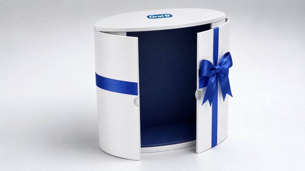
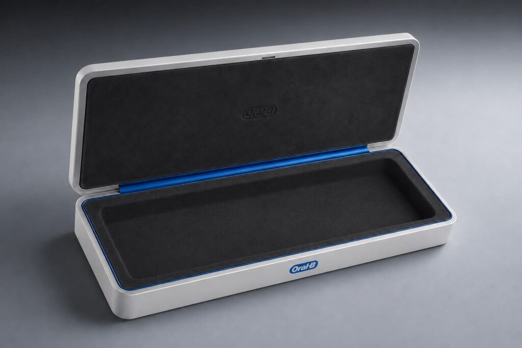
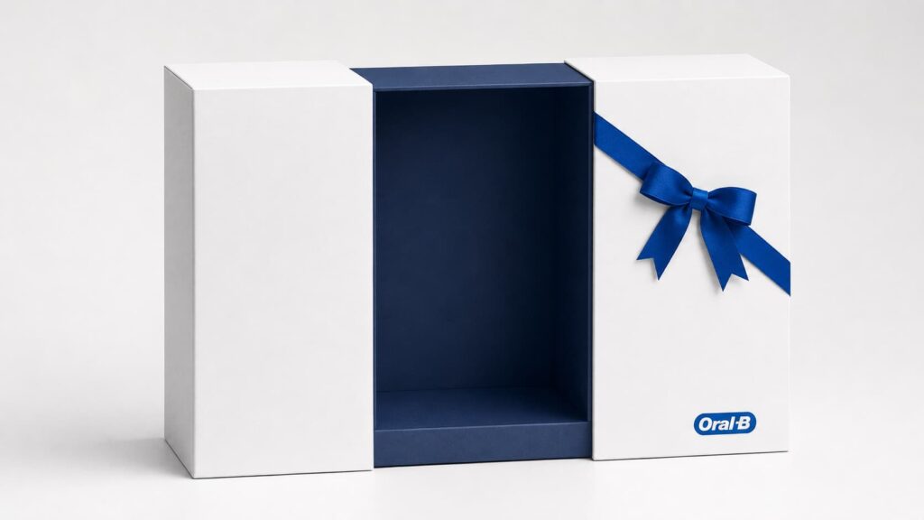
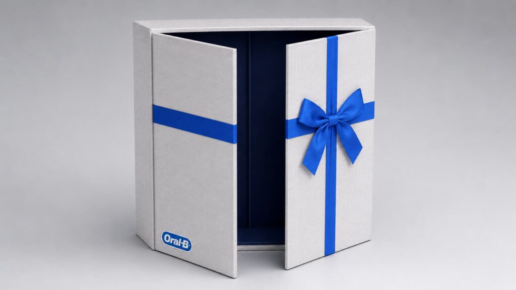
I created several structural directions that explored different ways of presenting and revealing the Oral-B gift sets.
The concepts ranged from a low-profile presentation case with a hinged lid to upright boxes with double doors, curved façades and sliding outer sleeves. Each direction created a different opening ritual while remaining part of the same recognisable family.
The design system was built around:
predominantly white exterior surfaces dark-blue interiors that framed the products blue satin ribbon as both a closure and visual signature minimal and carefully positioned Oral-B branding fitted internal trays for secure product presentation clean structural forms suitable for premium seasonal gifting restrained detailing intended to reduce unnecessary visual and material excess
The ribbon was used to guide the eye across the packaging and emphasise the moment of opening. Depending on the concept, it wrapped around the box, crossed the front panels or formed the central closure between two doors.
This created a recognisable gift language without relying on printed festive graphics that would quickly date the packaging or restrict it to one particular holiday.
The project resulted in a cohesive family of gift-set concepts that demonstrated how Oral-B could enter a more premium gifting context while retaining its established brand identity.
The different structural proposals gave the brand several options for product scale, presentation style and opening experience, all connected through the same white-and-blue visual system.
The result was a packaging direction that felt festive but not temporary, premium but still accessible, and recognisably Oral-B without resembling conventional retail packaging. It established a flexible foundation for holiday gift sets and other promotional moments, while supporting the cleaner and more considered positioning of the sustainable product line.