MADO
Translating an established Turkish brand for its first European location A complete brand-localisation and retail-communication project for MADO’s first European pilot store. The location at The Den Haag Centraal Station was created to test whether the established Turkish hospitality brand could connect with a European audience. The visual identity, menu presentation and customer-facing communication therefore played a central role in introducing the brand, its products and its cultural background to a new market.
Before MADO The Hague opened, the brand required a complete set of customer-facing materials for its first European location. The existing identity and communication had been developed primarily for the Turkish market. My assignment was to adapt this system for Dutch customers without removing the qualities that made MADO recognisable. This included designing and producing: complete food and drinks menus in-store menu boards promotional advertisements seasonal and product campaigns printed retail communication translated and rewritten menu content locally adapted brand applications Because the location functioned as a pilot, these materials were not simply supporting assets. They shaped how European customers would first encounter, understand and evaluate the MADO brand.
Making a culturally specific brand accessible without making it generic MADO already had a strong history, product range and identity, but many of its menu conventions, product names and visual references were unfamiliar to Dutch customers. The challenge was to make the offer understandable and commercially accessible while preserving its Turkish character. Direct translation alone was not sufficient. Product descriptions, menu structures, hierarchy and imagery all needed to help customers understand what they were ordering and why the products were distinctive. The project also had to work within a compact and fast-moving station environment. Customers needed to recognise products, prices and promotions quickly, while the overall presentation still had to communicate the richness of MADO’s desserts, ice cream, bakery products and hospitality culture. The pilot carried more pressure than an ordinary restaurant opening. Poor communication could easily be interpreted as poor market potential, because humans often judge an entire international expansion strategy by whether the menu is readable before their train leaves.
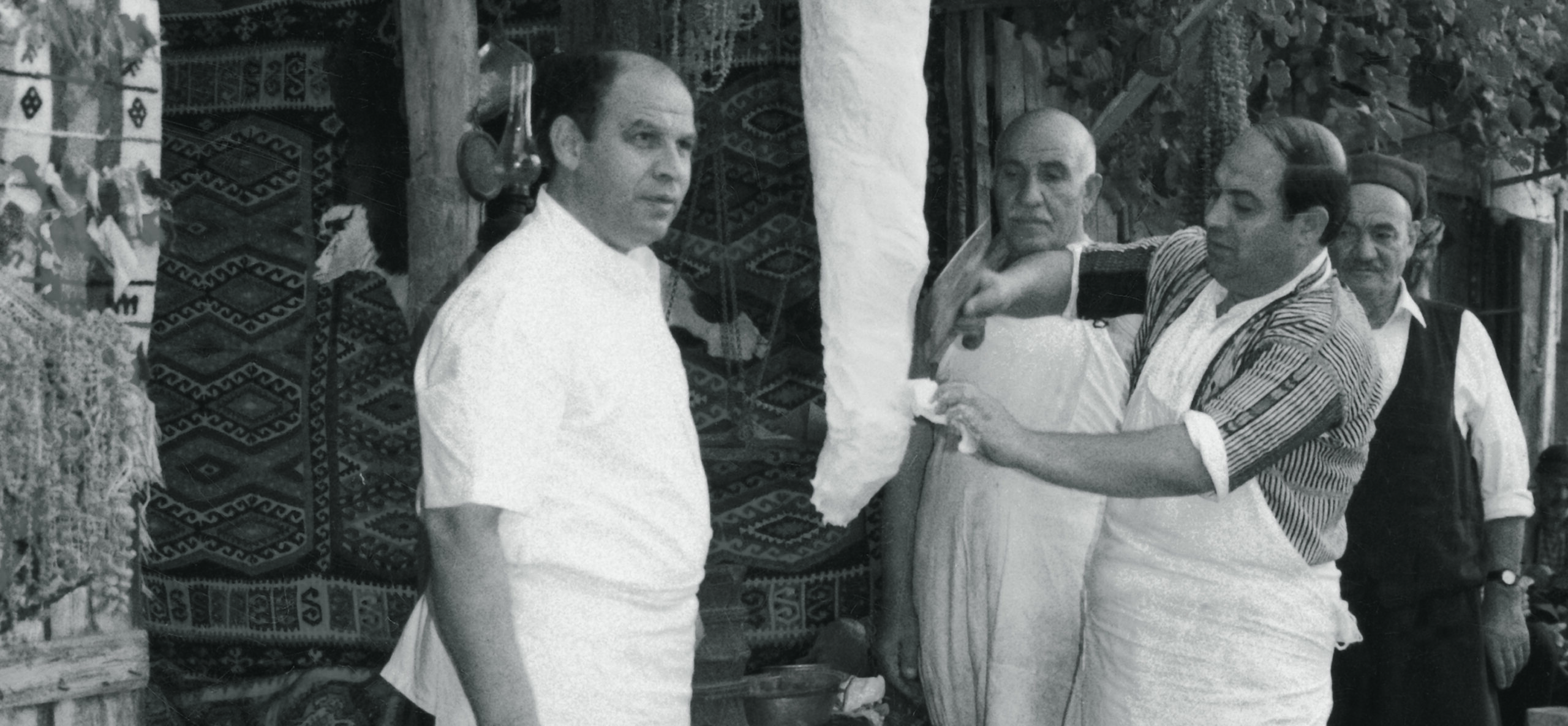
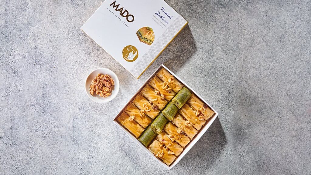
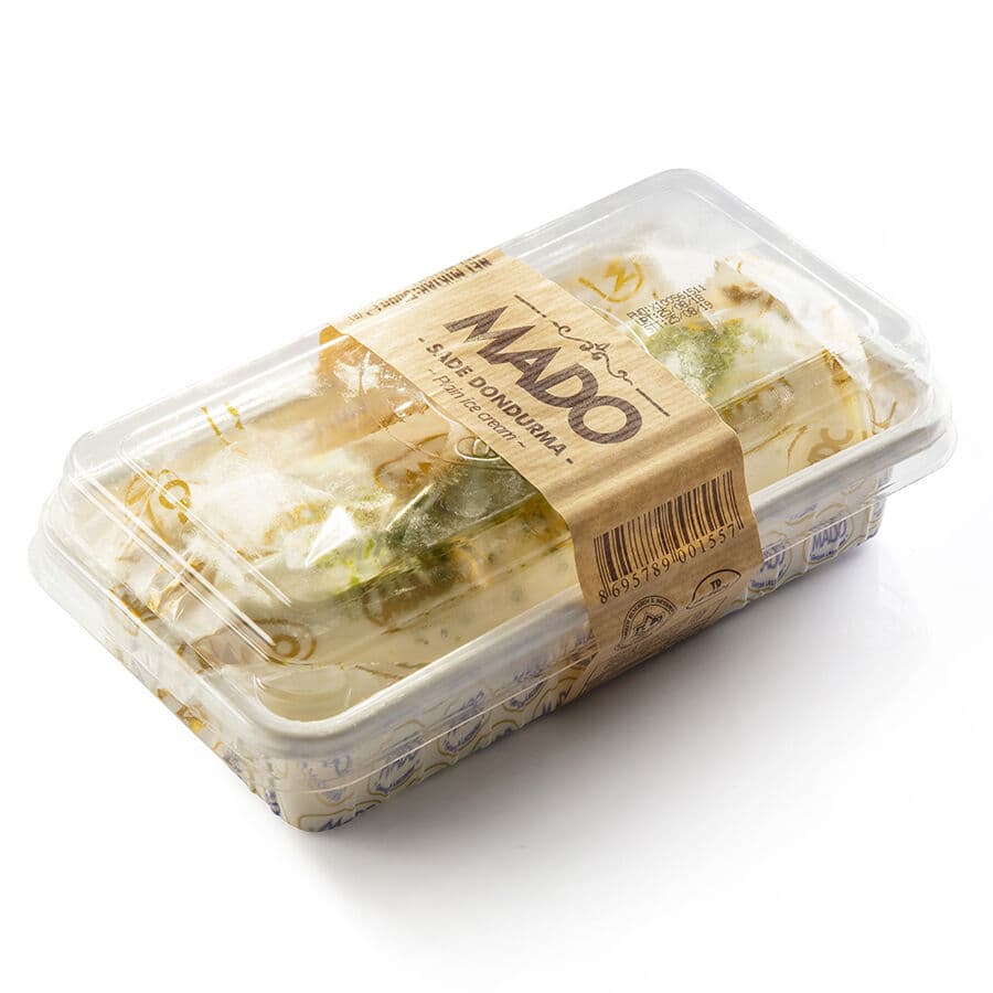
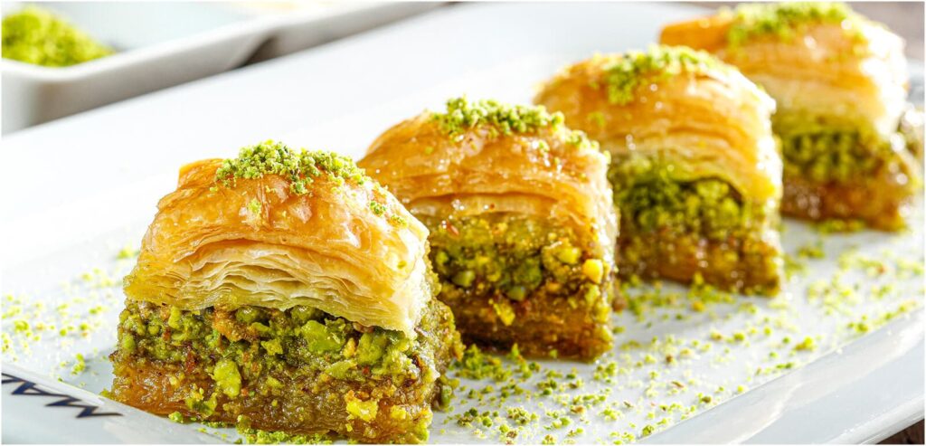
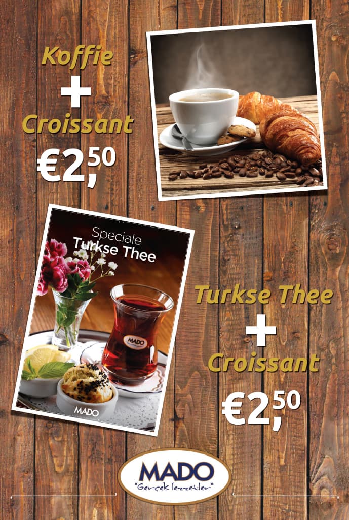
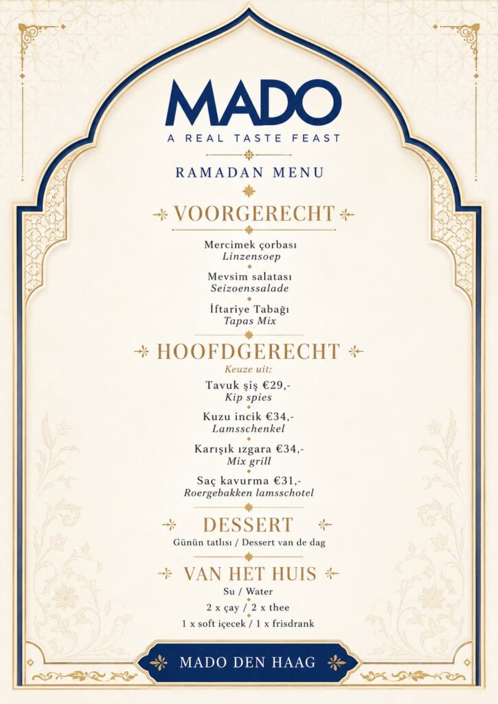
A locally adapted identity built around product appeal and clarity
I created a complete Dutch-facing communication system that retained MADO’s established recognition while making the experience more accessible to a European audience.
The menu structure was reorganised to create clearer categories, stronger hierarchy and easier product selection. Turkish menu content was translated and adapted for Dutch customers, with supporting descriptions where cultural or culinary context was needed.
The visual system combined MADO’s existing identity with:
prominent food and dessert photography clear Dutch product naming and pricing warm materials and textures associated with craft and hospitality recognisable MADO blue, gold and cream brand elements campaign layouts for coffee, tea, pastries and seasonal offers premium compositions for baklava and dessert presentation scalable templates for menus, posters and in-store boards
Rather than treating localisation as a cosmetic exercise, the work connected branding, language and customer experience. Every communication asset was designed to help a new audience understand the products while preserving their origin and perceived quality.
The Den Haag Centraal Station location successfully introduced MADO to the Dutch market and demonstrated that the brand could operate beyond its established Turkish context.
The visual identity and communication system provided the pilot with a coherent and locally relevant customer experience from launch. Customers could navigate the product range more easily, while MADO retained the cultural and visual qualities that differentiated it from conventional European cafés and dessert brands.
Following the success of the pilot, MADO expanded to additional locations and moved into larger premises. The launch project therefore became more than a temporary set of opening materials: it established an early visual and communicative foundation for the brand’s continued presence in the Netherlands.
The project demonstrated how thoughtful localisation can help an established international brand enter a new market without flattening its identity into something safely forgettable.